The Power of Typeface: How Fonts Influence User Experience
The choice of typeface plays a crucial role in shaping the overall user experience on a website. Different fonts convey distinct emotions and messages; for instance, a serif typeface can evoke a sense of tradition and reliability, while a sans-serif font often appears more modern and approachable. This variance in perception highlights why selecting the right font is not merely a cosmetic decision but a strategic one that can influence a user's feelings and actions on a webpage. When users feel a connection with the typography, they are more likely to engage with the content, resulting in improved readability and a lower bounce rate.
Moreover, the power of typeface extends beyond aesthetics—it directly affects usability and accessibility. Good typography enhances the readability of text, making it easier for users to digest information quickly. For example, using a clear and legible font size can significantly improve user experience, particularly for individuals with visual impairments. Additionally, incorporating contrasting colors between text and background not only elevates the visual appeal but also ensures that content is accessible to a broader audience. Hence, understanding the psychological and functional aspects of typefaces is essential for any web designer aiming to create a user-centric experience.
Choosing the Right Font: A Guide to Typography for Web Design
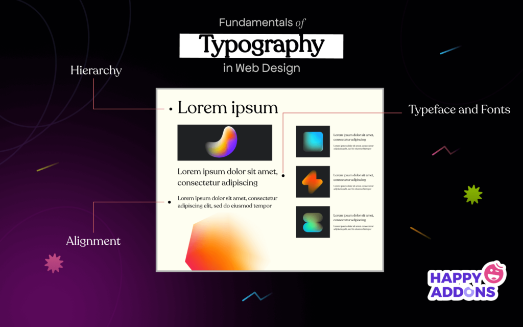
When it comes to web design, choosing the right font is crucial for creating a visually appealing and user-friendly experience. Fonts not only convey the tone of your content but also impact readability and accessibility. A well-selected font can enhance your brand identity and guide the audience’s emotions, making it imperative to consider factors such as legibility, style, and versatility. To help streamline your decision-making process, consider creating a type hierarchy that organizes font choices into categories for headings, subheadings, and body text. This allows for a more cohesive and structured layout.
When selecting fonts, it's important to keep mobile responsiveness in mind, as a significant portion of web traffic comes from mobile devices. Ensure your chosen typefaces are easy to read on smaller screens and maintain sufficient spacing and contrast for optimal visibility. You can also experiment with a limited color palette to make your typography stand out without overwhelming the user. Remember, consistent typography across all your web pages is essential for building familiarity and trust with your audience. With careful consideration and thoughtful application of these guidelines, you can make informed choices that elevate your web design.
10 Common Typography Mistakes That Could Harm Your Website's Appeal
Typography plays a crucial role in web design, and making mistakes in this area can significantly harm your website's appeal. One of the most common errors is using too many font styles. Overloading your site with various typefaces can create visual chaos, making it difficult for users to focus on your content. Aim for a consistent typographic hierarchy by limiting yourself to two or three fonts that complement each other and align with your brand identity. Additionally, neglecting proper font sizes can lead to accessibility issues, as text that is too small or too large can deter visitors from reading your content and engaging with your website.
Another prevalent typography mistake is poor line spacing, or leading, which can affect readability. Lines that are too close together or spaced too far apart make it challenging for users to follow the text. A rule of thumb is to use a line height that is at least 1.5 times the font size for optimal readability. Furthermore, using colors that lack sufficient contrast against the background can render your content unreadable. Ensure that your text color contrasts well with your background to enhance legibility. By avoiding these common typography pitfalls, you can improve your website's overall appeal and user experience.